Amy Boyle Photography is a talented Chicago photographer who specializes in lifestyle and theater photography. Amy’s brand had a signature triangular shape with her initials “ABP” for years. We decided to be brave and take a step back and reevaluate if the “brand by initials” style was working for her and try out new options in this rebrand exploration.


We shifted the old true light blue and brown palette that was popular in the early 2000’s to more of a sea-blue and gray, that prints beautifully as a silver foil on the business cards.
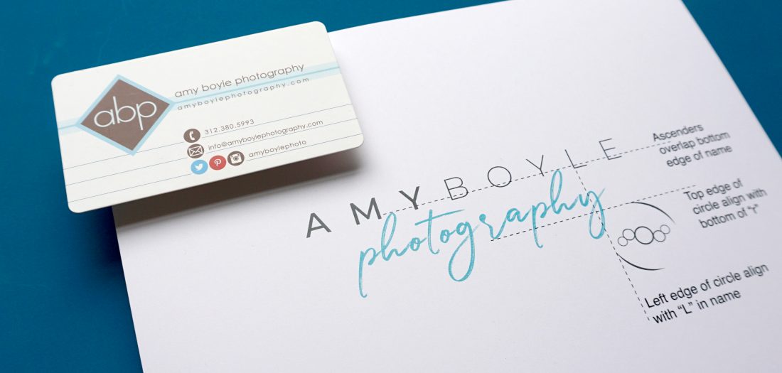
Amy realized she was known in her world simply as “Amy Boyle”, and “abp” although modern in it’s lowercase style, wasn’t her calling card. We took the bold step away from the initials and started to explore font combinations.
The full logo tag in the corner of Amy’s work appears as a clean, modern pop of her brand.


The round icon in the corner has a few meanings…
The first hint is to evoke an abstract camera lense. Then the 4 small circles around the big circle represent Amy’s four (yes, four!) boys that are always a part of who she is… as a lifestyle photographer, you capture life through the lense of the people closest to your heart.
