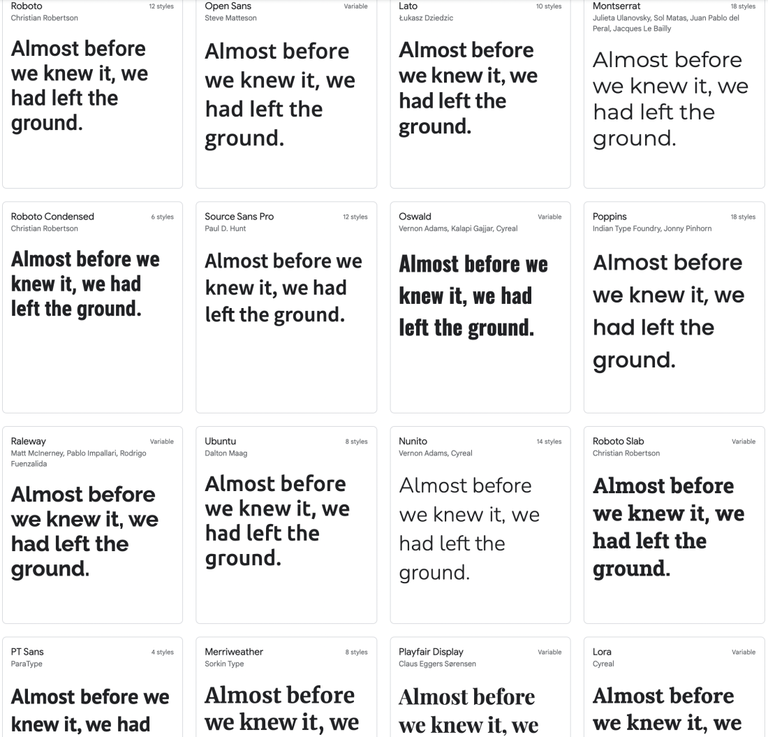
Google fonts is a database of curated fonts from designers and type foundries across the world completely free and open-source for anyone and everyone to use. This collection includes multiple languages, styles, and even symbols & icons. Drilling down ever further, you can filter options by font properties and categories, through all 1,284 family options.
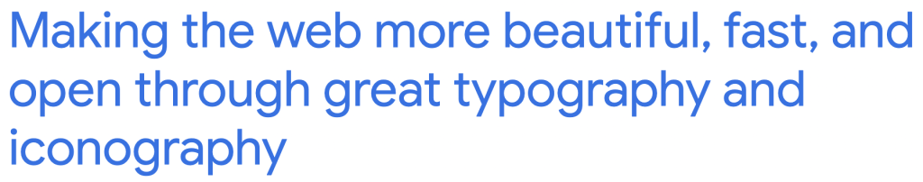
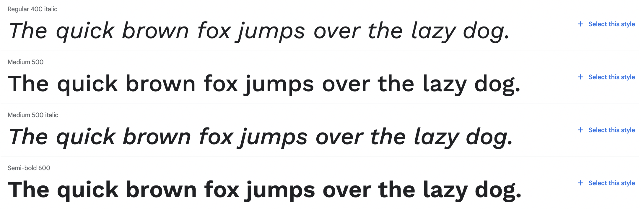
Within each font family, Google provides you a list of styles, with an option to try out sample text. You can download font weights individually or by family (pro tip: always download the family), see a sampling of glyphs, read a description about the typeface family origins and designer (if you really want to nerd out about fonts), and even see some suggested pairings of additional fonts with your selection. As far as test drives go, you really don’t need anything else.
Going down the list of options, we’d bet that you might not have heard of most of these fonts – we’re not talking about Helvetica look-a-likes here, but rather a collection of various fonts with personality and flexibility. With category options for serif, sans-serif, monospace, display, and handwriting styles, there is something for every project. You do need to have a little bit of background knowledge on these typeface terms to really get the most out of the sort features. But, for someone trying to expand their font world, this is a great place to start. *if you wanted to shorten, I think you could eliminate this paragraph and go right into availability and history below*
One of the major issues with font usage these days is availability, pricing, and how to find alternatives. We alluded to some of those struggles we’ve encountered over our design years and can attest that font licensing can be a tricky slope to navigate. There are several websites out there, such as FontSpace, DaFont, Creative Market, and Behance that offer free fonts with open licensing for download, available in a wide range of style options. But, oftentimes, you just don’t find the variety within one of those typeface families; sometimes these come in one style only (for example, just the “thin” version and no bold, or just bold and no italics), and a lot of times, the font you fall in love with is a “demo” font with no numbers or punctuation (oops, been there, done that).
Enter: type foundries. Or rather, enter digital type foundries. A type foundry is a company that designs and distributes a typeface. Let’s go back to the birth of the printing industry, when the first type foundry was created in tandem with when the first print runs of the Bible were done on the Gutenberg press in a font called “Textura” – what we typically know as Blackletter.
As the printing industry grew, more handmade metal type foundries were created as a response to the variety that book printing demanded. Imagine a time when only scholars wrote things with a brush and an ink well, switching to a system where a machine that needed to have the letters standardized was a big deal! This style of typography design (for back in the day when anything printed was printed on a press with each letter being set by hand) lasted until the birth of the typewriter, and later the computer, with designers pivoting to meet the technology evolution that would lead us up until now. Type foundries today almost exclusively design fonts for the modern world, and there are quite a few established foundries creating new typefaces to support the growing trend of individuality and personality in brands. If you’re a big name company with a unique brand, you start by paying a type foundry to design a typeface that only your brand can use.
For the rest of us, foundry typefaces are almost exclusively for sale, following a use-based price structure, with different licensing options based on company size or method of use (ie, print only, web only, etc.). There is no true rule on how a font family can be priced out, but if you frequently seek these out, you’ll come to learn that some of the popular commercial typefaces can run you a few bucks. It’s all relative, but for example the entire Gotham font family by Hoefler & Co. will run you about $1,472 whereas the Futura font family by Linotype will run you about $399.
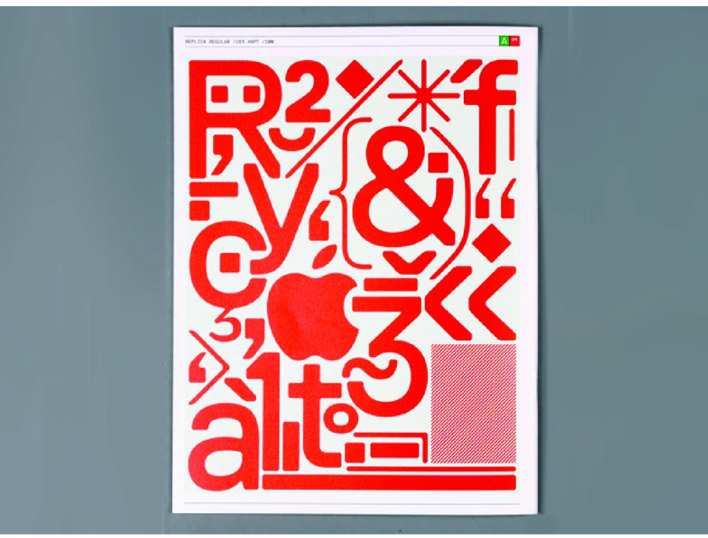
If you’re looking for something a little outside of the mainstream, a type foundry may be a good choice for you too – there are lots of experimental and art-based typefaces as well. Here are a few that we love.

“Our fonts are made by designers, for designers. They are graphical machines, engineered to capture the vibes of the now, and capable of generating vanguard visuals – something that we also showcase in our printed publications. Love them or hate them, they’ll never be boring.” www.swisstypefaces.com
“Approaching our eclectic aesthetic interests with a contemporary perspective, Lineto is dedicated to the research, design, development and production of fresh and original typefaces, unique in concept, exquisite in design, and flawless in production. And, as we believe, inimitable in result.” www.lineto.com
“MuirMcNeil’s activities are focused on exploring systematic and algorithmic methods in type design, graphic design and moving image.” www.muirmcneil.com
Alternatives to these foundry-created fonts have become quite popular, and even more so those that have the same level of variety without the price tag. In our opinion, Google has really created a valuable and extensive font database for all designers that is not so well known – at least in our circles. They’ve created a resource that actually expands beyond the design community, making beautiful typography (and vector icons, too) available to everyone. They are easy to peruse and even easier to download and install safely onto your computer. So, if you haven’t already — do a few clicks and head over to fonts.google.com and explore. And keep your debit card in your wallet, you won’t need it!