


Some may say that their creative output lives and dies by Pantone….others may say ‘do you mean Pantene?”
To be clear, not talking about this:

Based on the world you live in, Pantone may or may not play a huge role in it. For us, it’s a mix of both, a result of living in a digital age and being deeply rooted in print production.
PMS (or Pantone Matching System) is a universal way to achieve color consistency across digital devices, printers, markets, and even languages. You can use the same red PMS color of a Coke can on your birthday invitations if you wanted because of accessibility and ease of use.
But why are colors so important?
Pantone says:
“A brand’s color is critical to its identity – creating associations and expectations, triggering mental images and memories. Studies show that the right color can increase brand recognition by up to 87%.”
Furthermore, “In product development, the right color is the differentiating factor that can capture attention. It is also the most important design element for reflecting mood and style.”
The right color can sell products and ideas more effectively by 50-85%.
Pause – I know anyone reading this just stopped to ‘google’ which colors are most the effective to drive sales.
- Ok, so to review so far:
- colors = important, simple branding = key, and PMS = necessary.
That catches us up to Pantone’s ‘color of the year’. Each year, Pantone develops one or two colors that evoke a mood-of-the-times, the culmination of the world’s pattern in color usage. We assume there is some semblance of market trend research involved and not just some interns pulling colors out of a hat.
2021 Goes to …
Earlier this year, Pantone unveiled Ultimate Gray & Illuminating Yellow for it’s 2021 choices and had this to say about it, “PANTONE 17-5104 Ultimate Gray + PANTONE 13-0647 Illuminating, two independent colors that highlight how different elements come together to support one another, best express the mood for Pantone Color of the Year 2021.

Practical and rock solid but at the same time warming and optimistic, the union of PANTONE 17-5104 Ultimate Gray + PANTONE 13-0647 Illuminating is one of strength and positivity. It is a story of color that encapsulates deeper feelings of thoughtfulness with the promise of something sunny and friendly.”
Honestly I feel the colors just ooze…weather. It’s sunshine and clouds for me.

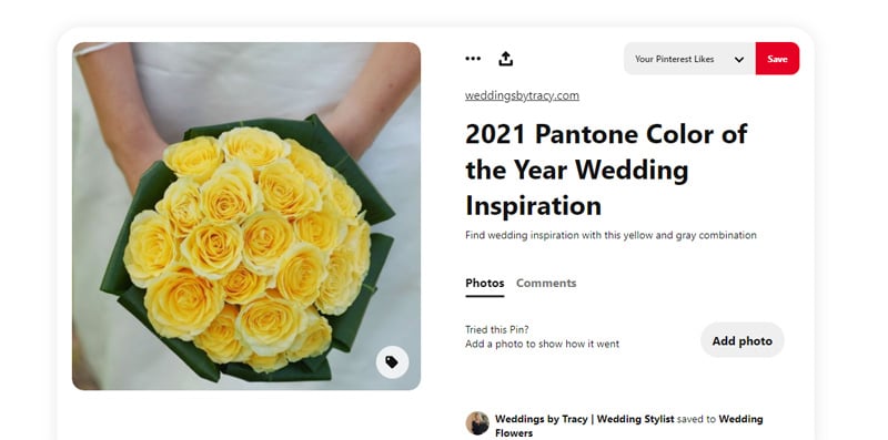
The question is, is this a “if you build it, people will come” situation, or was this a trend already in the making? How this palette unfolds this year is what is most interesting to me. Here’s a unique perspective: brides.

From our experience, you can start to see the Pantone colors of the year edge their way into the wedding industry and quite often make their way onto wedding invitations and décor. It might take a full year for that cycle to come into fruition (remember, it takes a minute to plan a wedding).

And why weddings? Because photographers start posting photo shoots with that color. It makes its way to Pinterest, and blogs, and “hottest trends” tweets.
And before you know it, Target starts selling throw pillows in that color scheme. Add a few patent leather peak-a-boo pump glam shots and *poof*, the market has just been seduced by a Pantone color of the year marketing campaign. We’re not complaining.
But, whether you like or dislike, use or ignore, the Pantone Color of the Year is always a hot topic in the design community, and we are always left wondering: what will be next?