‹ Back to Portfolio and Case Studies

Lake Meadows Apartments

A classic, mid-century apartment complex gets a refresh that pleases residents and the larger community.

Customer Service Hero: Amanda Snyder
Project Manager: Renee Castro
Sales Project Manager: Erik Reczek
Account Manager and Photography: Josette O’Neil
Writer: Jon Davis

Lake Meadows Spotlight Proof Video

This is "Lake Meadows Spotlight Proof Video" by Cushing on Vimeo, the home for high quality videos and the people who love them.

Managing Effort

Colleen Needham is a vice president and property manager at Draper and Kramer.

In October, she celebrated eleven years with the real estate firm.  Her first role was in property management, with Draper and Kramer, in the Chicago suburb of Arlington Heights, at Brook Run Apartments. In April of 2017, Colleen transitioned to Lake Meadows to oversee the refresh.

A Grand Plan

For inspiration, they didn’t have to go far. In fact, they just looked around their existing buildings.

“We wanted the rebrand to look more in line with the actual mid-century modern aesthetic of the buildings,” says Colleen. “More linear and intentional.”

Pulling it Together

A commercial real estate marketing firm was hired to put together a branding package.

Cushing was brought in early to consult on fabrication and budget. From design intent to production, the refresh came together over the course of eighteen months. ADA signage and monument signs are the most recent part of the installation, completed this year.

Results are an array of interior and exterior signage.

Fun Fact

Did you know Lake Meadows once had a separate club and ice rink with their own Zamboni?

Creative Corridor

Lobby wall graphics denote each floor with a number to keep guests and residents aware.

Look close for tasteful designs that feature foliage and construction close-ups. Graphics appear across twenty floors in four different buildings.

Printed on 3M IJ 180 C with a 3M 8520 scotchcal matte overlam. The surface is painted drywall.

Monumental Achievement

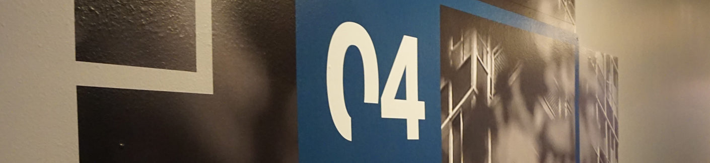
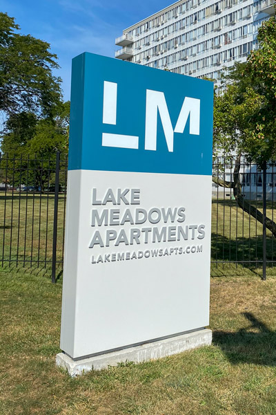
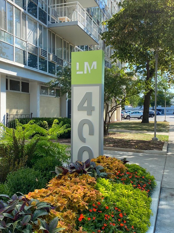
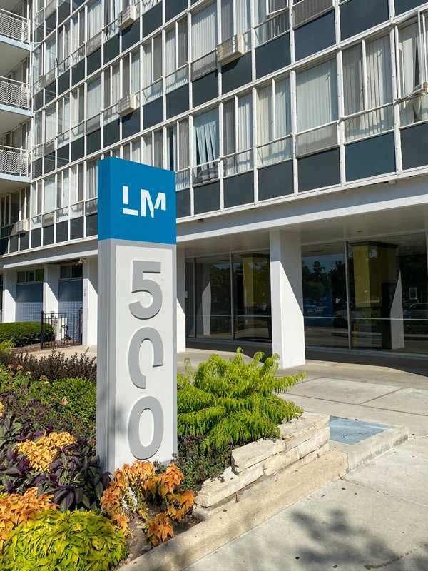
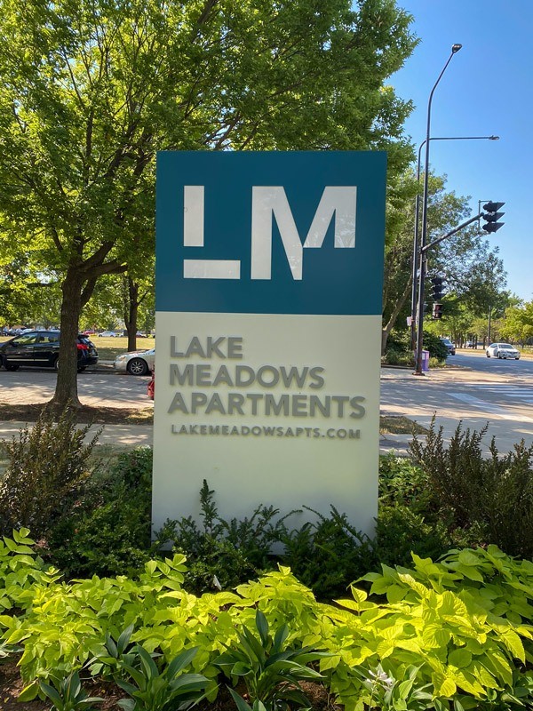
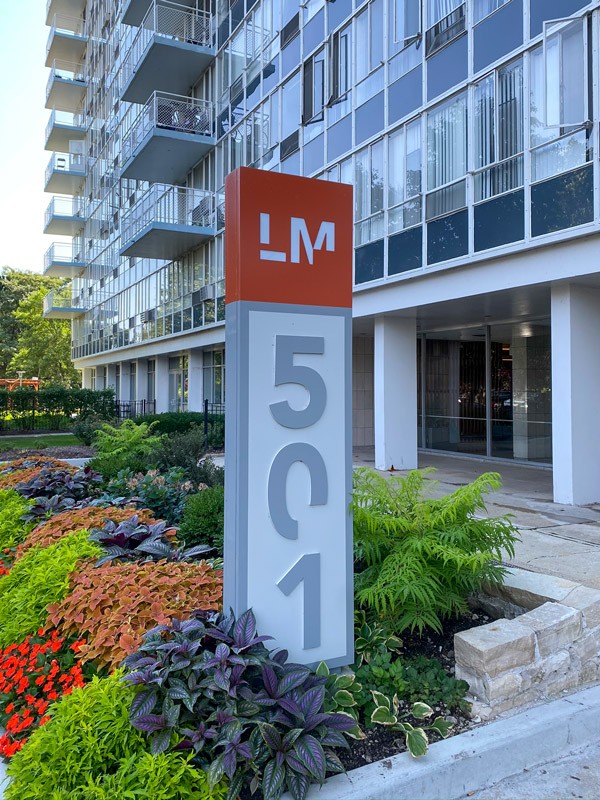
Approach the property and you are greeted with monument signs.

Promotional pillars mark the spot and attract potential residents. Signs are both Illuminated and non-illuminated.

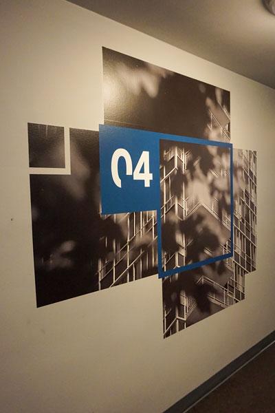
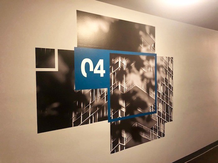
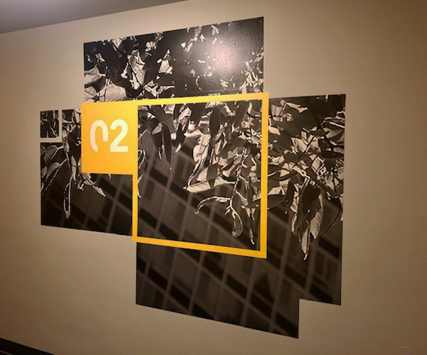
Let There Be Light: To bring this together, concrete footings were installed onsite and the fabricated aluminum sign cabinets were direct embedded into these concrete bases.

Acrylic “push-through” – yes this is a technical term – backlit lettering illuminate some of the signage. The “milky” white acrylic shaped to CNC cut areas which lets light pass through. There are two monument signs and four building ‘blade’ signs.

Troubleshooting or Challenges?

In terms of timeline, there were a couple of minor delays for interior signage in the amenity spaces. Overall, no significant setbacks to prevent a successful installation.

“There were all kinds of changes. But that’s just normal with a project of this scale; items always pop up. Things like permitting and footing for mid-rises. Overall, Cushing addressed anything that came up and it was a great experience.”

Did you know Chicago Prairie Tennis Club, which is on the grounds at Lake Meadows, has hosted stars such as James Blake, Sloan Stephens and Venus and Serena Williams?

Other Signs

Fabricated aluminum cabinets serve – yes, a pun based on the Serena & Venus Williams fun fact above – as non-illuminated signage. Graphics were frisket-painted. A frisket is a plastic sheet with an adhesive backing used to “mask off” specific areas of an image. Why do this? So that only the exposed area is covered with paint.

End result?

A 70” tall sign – two feet wide and eight inches deep. There are ten non-illuminated signs installed around the property.

“Given that the Lake Meadows community spans over 70-acres, we knew our interior and exterior signage package would be significant and quite varied.  With a tight budget, we also needed an experienced partner who could handle a ‘design-build’ arrangement.  Working with Cushing allowed us a ‘one-stop shop’ to ensure an attractive and cohesive, yet cost-efficient program.”
Graphics to Promote Amenities

Branding while waiting for your clothes to dry? Of course! This look was achieved with vinyl cut textured wall graphics that were heat-applied to brick.

3M LX480 cV3: the worst vanity license plate ever? Nope! It is Envision Wrap film with 8548 gloss laminate. For those not as technical: It’s an efficient material for this type of installation. You can see these graphics in four of the buildings.

Information signs were direct-print to painted aluminum panels and wall-mounted. 

These were not ADA compliant signs, but rather additional wayfinding signs – like the “rules” in the laundry and fitness rooms.

Installed ADA Signage

For 1,280 units, room identification signs were installed with 1/8 (one-eighth) inch thick P99 acrylic. The sub-surface uses brushed aluminum paint. The charcoal raised copy and border and grade two braille follow ADA signage requirements. Additional ADA compliant signage included amenity signs, bathroom signs and suite ID’s.

Any Last Comments?

“Cushing produced a great product for all of our items that we needed during our rebranding project.   Josette and her team were attentive to our needs as the project progressed and if there were issues, they took care of it with no problems.”
Colleen Needham, Property Manager and Vice President

We're Ready to Assist You

We’d love the opportunity to hear about your graphic goals. Let’s connect to discuss your project and bring it to life.

Request My Quote